Ministry of Sound Vodka


Overview
Briefed to deliver a noisy campaign positioning Ministry of Sound Vodka against all other pure and refined competitors on the market, Ministry of Sound wanted to create a drink’s brand that was no-nonsense.
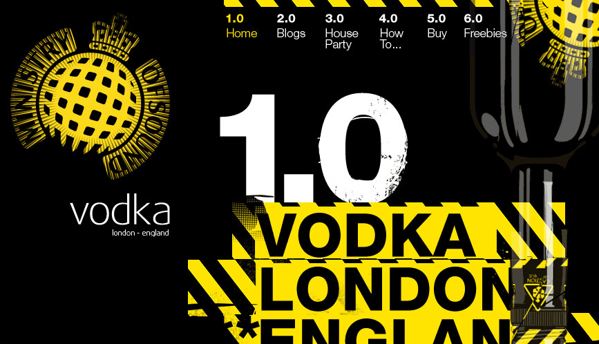
In line with the in-your-face attitude of the vodka, we built and designed a site with just the same punch. Using hazard chevrons and bold colours, our design perfectly embodied the product's character. With blogs, competitions and videos populating the website, it engaged it’s target audience and also cheekily refused access to anyone over 35, turning the traditional age restriction on its head.
However, those ‘in the know’ may find another way in.
