BaByliss for Men Website


Overview
A bad hair day? Stubble worse than Homer Simpson? Look no further.
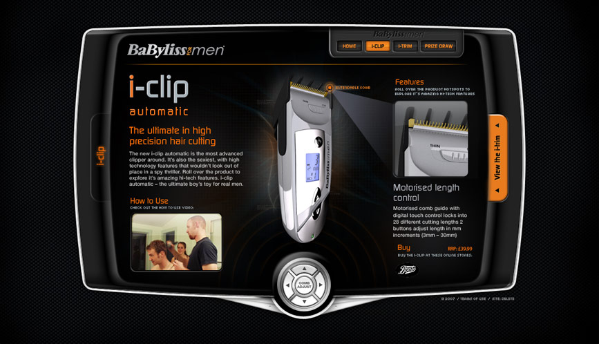
As part of an overall campaign to promote BaByliss’s new product range, including major online campaign Ugly Billy, we were asked to build a comprehensive product microsite for the new i-clip and i-trim, a hair clipper and stubble controller for men.
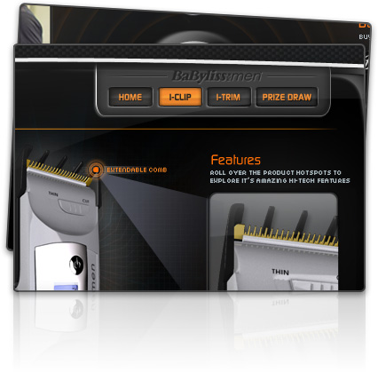
Positioning BaByliss at the forefront of innovation and design, our site reflected the slick and masculine character of the product. User’s could view a ‘how to use’ video, ogle at it’s sleek design or purchase online through affiliated sites.
